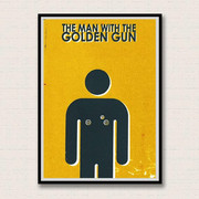
Minimalist Bond screenprints
Hello all,
I hope this isn't too cheeky being my first post and all but I've just set myself up an Etsy shop to sell some Bond screen prints I made last year and thought you guys might want to take a look.
I'm a huge Bond fan (so will certainly be checking out the rest of the forums) and an admirer of minimalist movie posters, so thought I'd have a go at my own. I've created a print for all 23 films, with the aim of encapsulating each through a single image.
Check them out here: www.etsy.com/shop/indyd
I'd love to hear your feedback!


Comments
I don't buy to display so no good to me as the value is in the image only but I do really like them
I should point out I'm planning on doing a series of postcards, so if anybody would like a 'whole set' it will work out a bit more manageable money-wise
I am not a friend of newly-registered people here immediately advertising their stuff for sale in the first post.
However, I like the concept - though would not buy for the above mentioned reasons.
And I fail to understand the connection with YOLT to be honest
Dalton - the weak and weepy Bond!
Poison drips down the string. The Skyfall one is puzzling me.
I know it's really rater cheeky of me to be advertising in my first post. I genuinely just wanted some feedback on what I've done - most people I know only watch Bond casually so don't get many of the images.
It's nice to hear what some Bond fans think of them.
Skyfall - Silva refers to himself and Bond as being the 'two rats left in the barrel'. Kind of summed up the film for me that image.
Oh yeah, I see it now.
I'd also like to thank you for being honest and up front in plugging them, rather than saying "I just stumbled on these and thought someone here might like them..."
Good luck!
{[] Thanks, Jono
Dalton - the weak and weepy Bond!
Other than that they're pretty good.
MG -{
Ps, you chose the wrong silhouette for the tank.
Pps, the balloon for OP just keeps reminding me of Saunders' death in TLD.
Vive le droit à la libre expression! Je suis Charlie!
www.helpforheroes.org.uk
www.cancerresearchuk.org
neither, its a late variant of the T-54 iirc, maybe T-54e. I know that for the film steel plates were laid down and washed with water and oil for the powerslide shot, and the tracks were off either a challenger mk1 or a chieftan tank as these tanks had 'road tracks' (ie rubber padded tracks that don't rip up tarmac) whilst the T-54/5 didn't have these as an option. To make this work the running gear of the tank was swapped over so the tracks would fit.
Vive le droit à la libre expression! Je suis Charlie!
www.helpforheroes.org.uk
www.cancerresearchuk.org
It's quite difficult to put a time-scale on each one, as they vary tremendously. For example, LALD was very quick as I knew what image I wanted even before I re--watched the film.
Then there were ones that took a lot longer. For Octopussy I wanted to use the Faberge egg and spent hours trying to create a decent image. In the end I had to give it up and went for the balloon!
When it came to the printing itself, I attend an adult learning course for just 2.5 hours a week, so I had to go in really organised and knowing exactly what colours etc I wanted. Or at least, that was the theory. In practice there have been many thrown away/stashed in a folder due to the colours not being quite right or the ink bleeding etc
Screen printing is by no means a perfect process, and when I started this project I was a complete beginner, so I've learnt much along the way!
I think one of the things I like most about the Bond film franchise is the way it juxtaposes light humour with more earnest or dramatic scenes. So I think it works to have the more 'comical' pieces next to the more 'significant' ones, as it reflects the tone of the films.
DAD was a difficult one if I remember correctly. For a start, I really don't like the film and consider it to be one of the weakest in the series. On re-watching, I distinctly remember nothing really 'stood out' for me as a central image or theme except the sword fight. Hence, the fencing mask.
I did put some research into the tank and thought I had the right one but then I don't really think many people will notice it's the 'wrong tank' as that's not really the point of these pieces.
Thanks for your response though, all opinions gratefully received.
Thanks for understanding.
I think the artwork really works in some but is a bit vague in others.
For DAD, I thought the car chase stood out. You could have the arse of the jaguar xkr on one side of the image and the nose of the vanquish on the other. Or the ice palace or the Antonov?
For OP I'd say the bede acrostar jet was pretty memorable as is the faberge egg.
As for if its the right tank, well I noticed, goes without saying others would too.
To be fair though, if you did this as part of a pt course and haven't done it before then fair play, it's a good effort and I hope you're successful with making some sales.
MG -{
Vive le droit à la libre expression! Je suis Charlie!
www.helpforheroes.org.uk
www.cancerresearchuk.org
I agree that exact detail does not matter in these images as it is a 'flavour' or the 'impression' that it conveys- - I like them even more that they are screenprints - some actual printing skills used.
well done on remembering anything about DAD!
Just picking one iconic image is difficult and of course in asking an opinion you are courting subjective comments.
This type of minimallist image was actually used in the original UK hardback books on the outer boards so really its nothing new
all the best with your art - Nick
However, I think the type could be a little more subtle. Perhaps even only visible if you really look well.
Could you make larger sizes?